The importance of well-designed registration forms on websites is often underestimated. But especially when it comes to digital customer acquisition, the registration form is the first way for potential customers to contact your company. Therefore a flawless design is crucial, because nobody wants to have to deal with complicated or even broken forms. Find out what you need to consider when creating your forms here.
1. Why do registration forms need to be flawless?
Most Internet users have already filled out a registration form. For many, this is a rather standard process. However, filling out a form can also quickly cause trouble, because every click too much is an effort, and effort = trouble. To avoid this, the visual appearance and user-friendly design is a particularly important point.
Keep it simple. Studies have shown that fewer fields lead to more conversion: Unbounce explains that a form with four instead of eleven fields even achieves an increase of 120% in conversion. It has also been found that each field that is omitted results in an increase of 8.5%. Good argument, right?
If your forms do get longer, there is always the option of dividing them into two or even three steps. For the customer, the form does not seem so cluttered at first glance, but you still end up with the information you need.
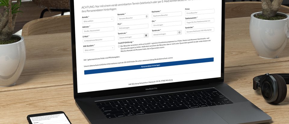
3. Design of your forms.
The design of registration forms today is often very creative and versatile. There are many possibilities, both technological and visual, e.g. for labeing the fields. A study by Eye-Tracker shows that labels are best seen when they are positioned directly above the field. Therefore: put the focus on easy handling and logical design.
4. Nail it on the mobile phone...
More than half of the world's Internet users use mobile data to go online. This means that many registration forms are also used from mobile phones. Your form must therefore be "responsive" to ensure the best possible view for all screen sizes, whether mobile, iPad, laptop or PC.
Tip: the Sweap registration form automatically adapts to all screen sizes and therefore offers the best possible user experience.
Check how your mobile version looks like.
5. ... and make the design on point
Design is an increasingly important factor in the customer's purchase decision. A study by Adobe confirms that for 74 percent of Germans, good design is more important than five years ago.
Websites in particular explain the values of a company. The registration form is an important part of your website and should also visually show what you stand for. A discrepancy between design and values causes mistrust among customers.
Tip: The Sweap registration form and the matching event website can be dynamically adapted - just as you wish.
6. Mark mandatory fields
Less is more: if you want to improve your conversion rate, you have to ask yourself which data is really important and which is just "nice to have". Basically, as a user you want to avoid any unnecessary work. Therefore mark the important fields with the standard symbol and note that these are mandatory fields (mandatory) under your form. In this way, the user knows that all other information is only used to speed up the processing of the contact request, but is not mandatory.
7. Treat sensitive data with care
Sensitive data should only be requested if absolutely necessary. This can be, for example, the age of the user, but also turnover figures or the position in the company. Many users are more willing to give an approximate indication for sensitive data, e.g. "Annual turnover: 100,000 - 500,000" or "Age: 35 - 45". This way, users are willing to give this information more freely, especially if they are genuinely interested in your services and the information is relevant to the contact.
Telephone numbers in particular are a tricky topic. As this study shows, asking for telephone contact details leads to 5% less conversion. So in the best case, do without it and rely on digital communication for the time being.
With Sweap to your perfect registration form
You now know what your registration form should look like and what content you want to ask for? Then you have already done the tricky part! Now you just need to create the form. You can find out how easy it is with Sweap, right here.
For given answers, you can choose any form of presentation (checkbox, drop-down menu, radio buttons). Likewise, you can add as many response options as you like.
You specify what text will appear after submitting and create the email that will be sent to your visitors.
Conclusion
Registration and contact forms are extremely important, especially in the B2B sector, and should never be underestimated. They form the contact basis for potential customers and visitors. Design your form with care, simple and effective. User value a fresh appearance that underlines your company values. Trust in a partner who offers you a reliable basis for your contact and registration forms.
You want to find out how Sweap can help you? Contact us here or try our demo version directly.